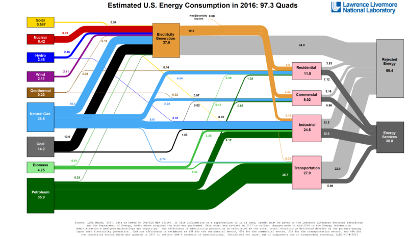
The Lawrence Livermore National Laboratory (LLNL) at the Department of Energy has been a huge help when it comes to tracking energy usage in the United States. They have made it easy to read and understand what our resources are being used in regards to energy. Each year the LLNL will collection information about energy usage and will create a chart to show how the energy is produced and used in the United States ranging from sources such as Petroleum, natural gas, solar panels, coal, and others. Last year’s chart is shown below.
This spaghetti chart above shows the production and use of energy in 2016. The largest piece of this chart,”Rejected Energy”, can be quite startling to know that this is wasted energy. Most of this wasted energy is heat which could be reduced if we were to apply other technologies to use it up. To learn more about this wasted energy in the United States please read this Article from Vox CLICK HERE. To learn about moving to clean-energy future CLICK HERE.

